 |
| Figure 1. P1 and P2 measure dt@lvl over the entire acquisition, while P3 and P4 measure dt@lvl for only a single operational cycle of zoom traces Z1 and Z3. |
As we learned in part 1, the dead time delay is measured using two instances of the measurement parameter Delta Time at Level (dt@lvl) as shown in Figure 1.
In the Figure 1, the dt@lvl parameters P1 and P2 show the value of the last measurement in the acquisition which contains 10,000 switching transitions. The parameters P2 and P4 measure only the single timing cycle shown in the zoom traces. (Click any image to enlarge it and see the detail.)
The values of both parameters are different, and you should ask the question: how does dt@lvl vary with time? To find the answer, turn on the measurement parameter statistics, as shown in Figure 2.
 |
| Fig 2. Parameters measure all instances of the measurement occurring in the waveform; statistics summarize all the values collected. |
Using the Track Function
 |
| Fig 3. A track of frequency parameter P1 plots frequency vs. time over eight cycles. The track is sampled at the same rate as the source waveform and remains time synchronous. |
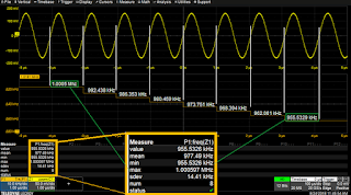
Figure 3 shows the track of a frequency measurement taken from another test, for purpose of illustration. Frequency decreases from ~1 MHz to ~956 kHz in eight steps corresponding to the cycles of the source waveform, which are clearly visible on the track.
The tracks of the two dt@lvl parameter measurements are shown in Figure 4.
 |
| Fig 4. The tracks of P1 and P2 show random variation between the min. and max. of each parameter. |
The maxima of the P1 dt@lvl measurement, 1.674 ns, was located on track F5 (top right grid) by using parameter P3 to apply the Maximum measurement to the track. Tracks can be measured just as can their parameter source waveforms.
The measurement x@Max was also applied to track F5 to determine the horizontal, or time, location of the maximum value. This value was then used to center the zoom traces Z1 and Z3, bringing the two edges with the maximum delay into view in the center of the lower left grid. A cursor was placed at that point in time to mark the location on all the traces. So, from an observable event on the track function, a specific set of edges were located and displayed for further analysis.
Using Histicons and Histograms
 |
| Fig 5. Histograms of P1 and P2 display the distribution of the dt@lvl parameter values. Histogram parameters read the mean, std dev and range of each histogram. |
The histogram itself provides a visual representation of all the measured parameter values. The bins farthest away from the mean (highest bar) contain the histogram tails, which hold the values with the lowest probability of occurrence. Seeing the delay data in this way makes it easy to determine the error margin for the deadtime.
The shape of a histogram is related to the underlying physical process causing variation. See our earlier posts on histograms listed below for more about histogram shapes. The shape of the histograms of the dt@lvl parameters in F9 and F11 is close to a Gaussian, or Normal, distribution. That implies that the process underlying the variation in values is random. The most probable source is edge jitter.
Histogram measurements can be used to quantify the histogram. The oscilloscope used in these examples has thirteen distinct measurements exclusively for histograms. In Figure 5, histogram measurements are used to determine the mean, standard deviation and range of values represented by each histogram.
Using Statistics to Test Tolerances
 |
| Fig 6. The setup for Pass/Fail testing offers choices based on the statistical mean (µ) and standard deviations (sigma). |
Learn more from the on-demand webinar, Best Practices for Debugging 48 V Power Conversion Systems.
Also see:
Measuring Dead Time in 48 V Power Converters, Part 1: Static Measurements
Getting the Most out of Your Oscilloscope: Tracks and Trends
No comments:
Post a Comment